LLMs generate accurate charts by describing data relationships rather than manipulating pixels.


The most common mistake when using LLMs for visualization is asking them to "draw" a chart, which often produces hallucinated data points. To ensure mathematical accuracy, the process must separate data retrieval from visual rendering. Vega-Lite serves as the ideal framework for this approach, as it allows the LLM to define data relationships in structured JSON rather than attempting pixel-level generation.
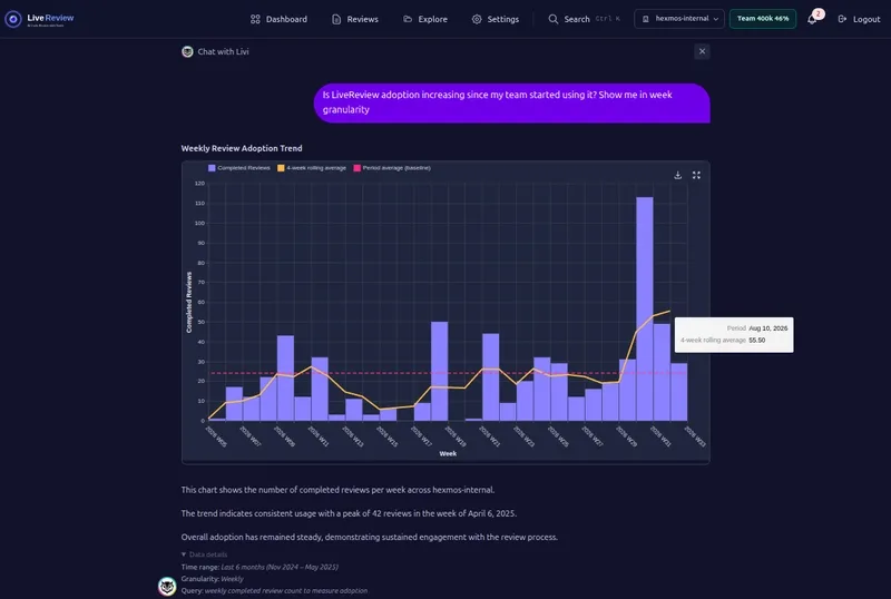
Instead of vague instructions like "create a bar chart," the LLM outputs a precise schema, such as:
{
  "mark": "bar",
  "encoding": {
    "x": { "field": "month", "type": "temporal" },
    "y": { "field": "review_count", "type": "quantitative" }
  }
}
This method leverages the LLM’s strength in selecting appropriate chart types (e.g., bar or line) while delegating rendering to a dedicated engine. The model handles presentation logic, while the engine ensures accurate pixel placement.
For production use, a multi-stage pipeline prevents errors like "4,000-bar chart" problems. The workflow begins with a volume check, where the LLM generates a SQL query to verify the dataset size. If the result is too large for visualization, the system defaults to a CSV or summary table. Only after validation does the system fetch the data and inject it into the Vega-Lite JSON’s data.values field. This ensures the LLM never interacts with raw numbers before rendering, maintaining strict control over data integrity.
Model performance varies in chart selection. Advanced models like GPT-4o or Claude 3.5 Sonnet excel at choosing the right chart type, while lower-tier models often default to bar charts regardless of suitability. The key lies in a tightly structured system prompt that defines the semantic meaning of data fields, enabling the model to distinguish between distributions (histograms) and trends (line charts). When the schema is precise, output reliability improves significantly.
All Replies (4)
Want a live back-and-forth? Join the global AI chat room — login to talk.
I was also confused about the data structure at first. Do you need to flatten everything first for this? I think you need to focus on the schema filling part mentioned in the previous comment. Most people try to force an LLM to generate a chart and end up with "chart-shaped fan fiction"—images that look plausible but have completely hallucinated data points. When building a data-driven AI workflow, the biggest mistake you can make is letting the model touch the pixels. The only way to ensure mathematical integrity is to separate the data retrieval from the visual representation. Instead of asking a model to "draw" something, the most robust method is to have the LLM output a JSON grammar. Vega-lite becomes the gold standard here. You aren't asking the AI to render a graphic; you're asking it to describe the relationship between data fields. For example, instead of a vague prompt for a bar chart, the LLM produces a structured schema:
{ "mark": "bar", "encoding": { "x": { "field": "month", "type": "temporal" }, "y": { "field": "review_count", "type": "quantitative" } } }By shifting the task to schema filling, you play to the LLM's strengths. Models are excellent at picking a mark type (like bar or line) based on context, but they are terrible at calculating the exact pixel height of a Y-axis. In this setup, the LLM handles the presentation logic, while a dedicated visualization library like Vega-Lite or Plotly ensures that the data is rendered accurately. You can try running a small test with your data to see if it works. This way, you can avoid the issues of hallucinated data points and get reliable visualizations.
So relieved to leave Matplotlib behind after those axis hallucinations. Is it always this stable? It really helps when you stop asking the model to draw pixels and instead have it output a JSON grammar like Vega-Lite to describe the data relationships.
System prompts are a lifesaver. Which schema version stopped your syntax errors the fastest?
I've found that having the LLM output a Vega-Lite JSON spec—like this structured schema with
"mark": "bar"and proper encoding fields—keeps the data honest and cuts down on those hallucinated chart points.Frustrated by nested transforms lately. Does this actually solve that specific wall? Instead of asking a model to "draw" something, the most robust method is to have the LLM output a JSON grammar. Vega-lite becomes the gold standard here. You aren't asking the AI to render a graphic; you're asking it to describe the relationship between data fields. For example, instead of a vague prompt for a bar chart, the LLM produces a structured schema:
By shifting the task to schema filling, you play to the LLM's strengths. Models are excellent at picking a
marktype (likebarorline) based on context, but they are terrible at calculating the exact pixel height of a Y-axis. In this setup, the LLM handles the presentation logic, while a dedicated visualization library like Vega-lite ensures mathematical integrity.