Boost API Conversions from 2.0% with These 5 Essential Pages
Most API products fail not because the backend is slow, but because the user journey is a nightmare of registration walls and empty dashboards. I've been looking at how to structure the frontend for an LLM-based service, and it turns out you only need five specific pages to turn a random visitor into a paying customer.
The "Try First" Landing Page
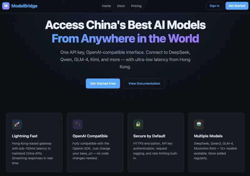
The standard "Hero text -> Features -> Pricing" layout is dead. The only CTA that actually moves the needle is a direct link to a playground. If you force people to sign up before they see a single token generated, you're losing them. By pushing the "Try Playground" button to the front and moving registration to the background, the goal shifts from "selling a subscription" to "demonstrating value."The Zero-Friction Playground
The key here is no login. No email, no password, no "verify your account." Just a model dropdown, a prompt box, and a response. If a user can get a high-quality answer in three seconds without giving away their data, they are significantly more likely to click "Get API Key" once they're hooked.The 30-Second Onboarding
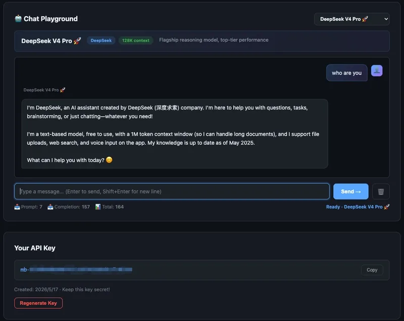
The "dead zone" in API products is the gap between account creation and the first successful API call. To kill this gap, the first page after login shouldn't be a dashboard—it should be a quick-start guide.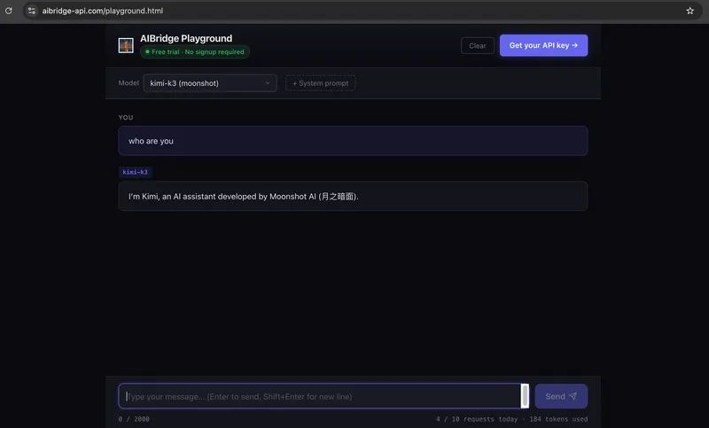
I recommend displaying the API key immediately alongside a pre-written curl command and a Python SDK snippet. If a user can copy-paste a command and see a 200 OK response in 30 seconds, they've crossed the bridge from "curious" to "integrated."
The Psychological Dashboard
Usage tracking shouldn't just be a number; it should be a signal. Using a color-coded urgency system for token limits works wonders:- Under 50%: Subtle blue bar (everything is fine).
- 80%: Orange bar (start thinking about upgrading).
- 90%: Flashing red bar (urgent action needed).
The Prompt Library
A blank input box is the enemy of adoption. Most users don't actually know how to leverage different LLMs for specific tasks. A prompt library serves as a practical tutorial, showing exactly which model to use for bug fixing versus translation. Each example should have a "Try it" button that pre-fills the system prompt and model selection in the playground.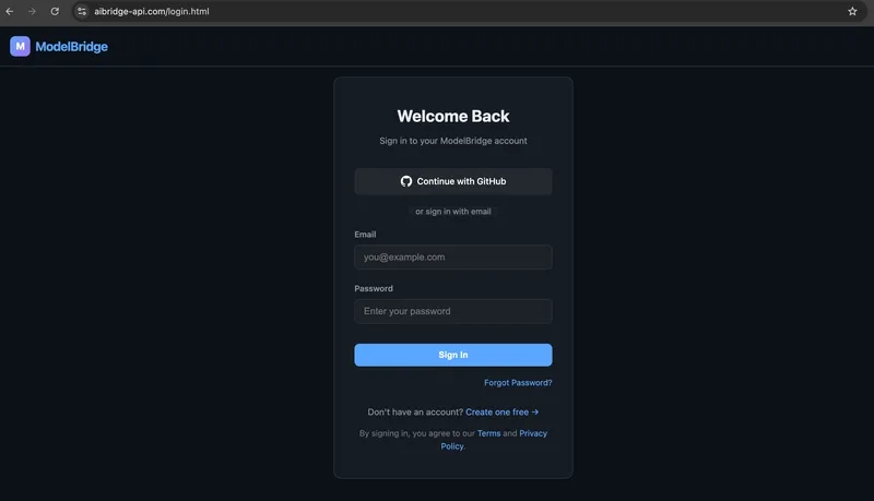
For anyone building a similar AI workflow, here is a basic structure for a prompt library card that drives usage:
{
  "category": "Code Optimization",
  "prompt_name": "Python Refactor",
  "recommended_model": "deepseek-coder",
  "system_prompt": "You are an expert Python developer. Refactor the following code for time and space complexity while maintaining readability.",
  "example_user_input": "def find_dupes(list): return [i for i in list if list.count(i) > 1]",
  "action": "Open in Playground"
}
By focusing on these five touchpoints, the frontend stops being just "documentation" and starts acting as a conversion engine for the LLM agent.
All Replies (3)
Want a live back-and-forth? Join the global AI chat room — login to talk.
Curious if this works for complex auth or if it just increases churn later.