Heatmaps Simplify AI Model Evaluation Reviews
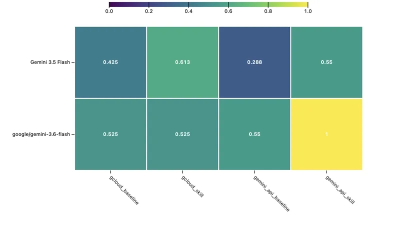
Presenting four LLM candidates across ten tools in a live session forces a visual overload. Columns shift, rows filter, and leadership watches a spreadsheet of numbers without recognizing any clear winner. Heatmaps turn this chaos into clarity by replacing raw values with color gradients—where a bright yellow spot in a purple field immediately signals superior performance over comparing 0.87 against 0.89.
Tools like inspect view handle granular log analysis or side-by-side metric sorting, but they lack the big-picture structure needed for multi-variable evaluations. A two-dimensional heatmap bridges that gap, exposing patterns where spreadsheets obscure them.
With a heatmap, teams can:
- Identify performance plateaus by observing where a model’s scores level off across different tasks.
- Verify skill improvements by watching color shifts when adjusting prompt techniques or tool-use capabilities.
- Compare entire model configurations at once by aligning models vertically and skills horizontally.
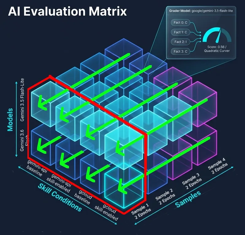
The setup requires inspect_viz, inspect_ai, and pandas. The visualization logic relies on the scores_heatmap function, which transforms evaluation logs into a structured grid. For custom builds, trace how raw data maps to axes—either horizontal or vertical—for readable interpretation.
Run the heatmap generation with this command after logs are prepared:
python3 inspect_viz_heatmap.py logs -o heatmap.htmlThe output matrix organizes data so:
- The vertical axis lists models or specific configurations, letting you track a single skill’s performance across versions.
- The horizontal axis covers skills or test cases, revealing how a model’s accuracy shifts with task difficulty.
In practice, a bright yellow cell—like 3.6-flash paired with gemini_api_skill at 1.0—becomes an instant discussion point. The visualization doesn’t just state “this model is better”; it presents a visual proof of its dominance. Without visualizing iteration deltas, evaluations remain static logs rather than dynamic insights.
All Replies (3)
Want a live back-and-forth? Join the global AI chat room — login to talk.
Side-by-side delta tables are a lifesaver! Do you use a specific tool to generate those automatically? I’ve found that moving beyond basic dashboards to use heatmaps helps leadership spot trends instantly without forcing them to do mental math on raw numbers.
I'm curious about the scoring. Are you using a weighted index or just keeping metrics isolated?
Anyone who has presented a performance breakdown of four different LLM candidates across ten internal tools in a live meeting knows the struggle. You wind up staring at a massive, cluttered dashboard, frantically reordering columns and filtering rows while leadership stares blankly at a wall of numbers. Communicating a clear trend becomes impossible when the audience must perform cognitive gymnastics just to identify which model is actually winning. A heatmap uses color intensity to represent numerical magnitude—accuracy scores, for instance—so the human eye spots a bright yellow patch in a sea of purple far more easily than it compares "0.87" versus "0.89" in a spreadsheet. While tools like inspect view excel at quick deep dives into specific logs or sorting metrics to see model-versus-model differences, they aren't designed for high-level storytelling. A well-constructed heatmap lets you spot model ceilings instantly and track skill gains visually, confirming whether adding a specific prompt technique actually moves the needle across your ten internal tools.
Heatmaps changed everything for me last month. I used color intensity to represent the numerical magnitude of each accuracy score, so bright yellow patches stood out against purple. Which tool did you use for the colors?