我用 AI 工具跑了一遍作品集设计
做一个能让客户一眼看清“你是干嘛的、服务谁、能不能交付”的作品集,其实比写代码还耗时。我之前一直在纠结,如果把这套设计流程交给 AI,能不能跳过那个对着空白画布发呆的阶段,直接进入“精修模式”?
下一篇
让 AI 直接写源代码真的太危险了 →
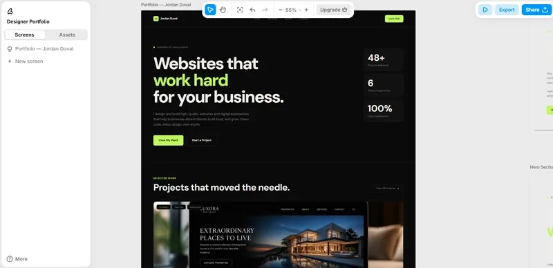
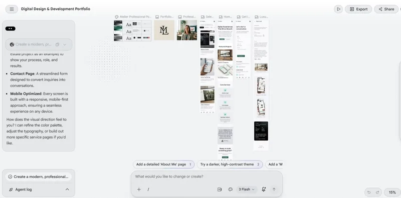
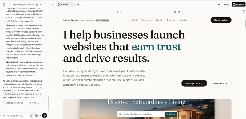
为了测试这个想法,我没写那些花里胡哨的长篇大论,而是准备了一套极其克制的、可以直接复用的核心提示词,然后扔给了 Figma Make、v0 by Vercel 和 Google Stitch。我的目标不是看谁生成的图更漂亮,而是看谁能真正理解“商业逻辑”:即如何通过布局来建立信任感。
这是我实测时使用的提示词模板,建议大家在做 UI 框架或者 Landing Page 时直接套用:
Create a modern, professional portfolio website for a digital designer and web developer who helps businesses build high-quality websites and digital experiences.
Include a strong hero section with a clear headline, short introduction, and CTA, followed by selected projects, services, about me, skills, work process, client testimonials, and a contact section.
Make the portfolio project-focused, with space to show screenshots, project goals, my role, services provided, and results. Highlight website design, UI/UX, responsive design, and real estate website development services.
Use a clean layout, strong typography, generous whitespace, subtle interactions, and a professional color palette. Keep the navigation simple and make the site fully responsive across desktop and mobile.
The overall design should feel polished, trustworthy, and human, not like a generic AI-generated template. Keep the copy concise and client-focused, explaining what I do, who I help, and why clients should work with me.在对比这几个工具的实操表现时,我发现了一个很有意思的现象:
- Figma Make: 它给我的不是一个“成品”,而是一个“设计方向”。它生成的结构非常符合信息架构逻辑(Hero → Work → Services → About → Process → Testimonials → Contact),这对于习惯在 Figma 里做原型的人来说极其友好,直接把“从零开始”变成了“选择题”。
- v0 (Vercel): 侧重于代码实现。如果你想要的是直接能跑的 React 组件或者 Tailwind CSS 布局,v0 的效率高得离谱,但它在处理“设计感”和“呼吸感”上,有时会显得过于规整,缺乏一点人文设计的温度。
- 避坑指南: 我发现目前的 AI 工具普遍存在一个通病,就是容易生成那种“用力过猛”的设计——过大的标题、廉价的渐变色、毫无意义的动画,以及那种一眼就能看出来的 AI 腔调文案。
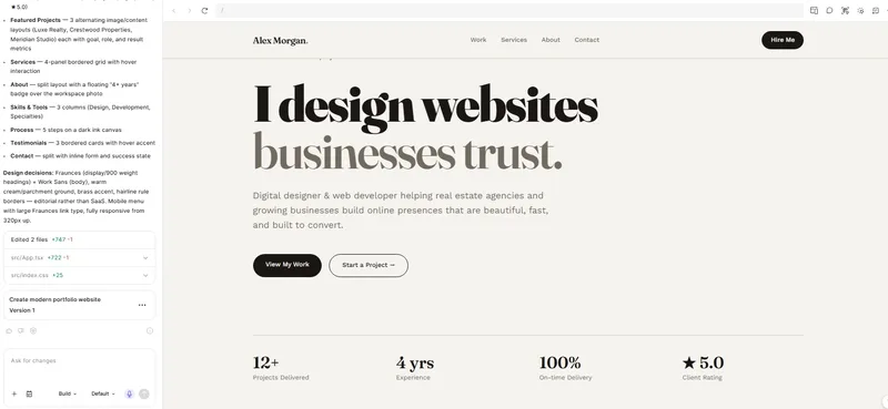
我的结论是:AI 绝对没法取代设计师,但它能极其高效地完成从“空白画布”到“初版原型”的跨越。对于我们开发者来说,用 AI 把那些重复性的布局、间距、色彩规范先铺好,把精力留给最核心的交互逻辑和业务逻辑,这才是最高效的工作流。
免费 AI 工具箱 · 全部完全免费